Understanding the components prop in react-markdown
Contents
Introduction
I have already looked at building a markdown-driven blog using Next JS. That tutorial includes a NPM package called react-markdown to parse Markdown. By default, react-markdown will convert Markdown artefacts to equivalent HTML elements - for example level 2 headings (denoted by ## in Markdown) map to straightforward HTML <h2> elements.
This article explores react-markdown's extended functionality that enables users to define custom React components that can be used in place of the default HTML element for a given Markdown artefact using react-markdown's components prop.
We will focus mostly on the <code> HTML element which will lead to another NPM package: react-syntax-highlighter - an amazing package that adds syntax highlighting to fenced code blocks
React Markdown
One of the advantages of using react-markdown is that you can pass plugins to change how markdown is transformed to React elements and pass components that will be used instead of normal HTML elements. That sounds, and is, an amazing benefit.
The react-markdown GitHub readme includes a section on using custom components that shows how to replace the default <code> HTML element with a custom component that incorporates the react-syntax-highlighter package. That addressed exactly what I wanted to do on my Next.js blog project so I was able to pretty much copy and paste that code into my Next JS app and get syntax highlighting to work.
Thing is, I didn't really understand how the code worked (as is ever the case with the cmd-c cmd-v process!) and knew I would struggle to apply the principle to a different HTML element. So I played around with it a bit more in an effort to understand what's going on. What follows is my attempt to clarify how you can apply the components prop in a react-markdown to generate custom HTML elements from your Markdown.
What is react-markdown doing?
Before we start analysing the components prop let's think about what react-markdown is doing behind the scenes.
Remember that Markdown is simply a text format. react-markdown steps through the lines in a document searching for Markdown artefacts. When it finds one it then converts the artefact into a React component that mirrors the behaviour of a default HTML element.
For example:
## This is a level 2 heading
would convert to
<h2>This is a level 2 heading</h2>.
So that's:
- a DOM node containing an
h2tag - with no
className - and a
childrenarray with just 1 element: the string of text.
A slightly more complex example:
A paragraph containing **emboldened** text
would convert to
<p>A paragraph containing <strong>emboldened</strong> text</p>.
So that is:
- a DOM node containing a
<p>tag - with no
className - and a
childrenarray with 3 elements:- a text node containing 'A paragraph containing '
- a DOM node containing a
strongtag- with no
className - and a
childrenarray with just 1 element: the string of text 'emboldened'
- with no
- a text node containing ' text'
Pre-defined HTML
react-markdown is 'pre-loaded' with a default HTML conversion for each Markdown artefact.
Using custom components in react-markdown
For convenience, I have reproduced below the custom component section from the GitHub link above so that I can talk through what's going on.
For the sake of clarity, I should point out that I have slightly changed the code in the GitHub example below. I replaced the self-closing
<ReactMarkdown/>with opening and closing tags, removed thechildrenprop and placed its value (ie.{markdown}) between the opening & closing tags. That was in line with console warnings that were logged when I was working with it. Perhaps the GitHub readme has failed to keep up with version changes - not sure.
(copied from GitHub)
This example shows how you can overwrite the normal handling of an element by passing a component. In this case, we apply syntax highlighting with the seriously super amazing react-syntax-highlighter by @conorhastings:
import React from 'react'
import ReactDom from 'react-dom'
import ReactMarkdown from 'react-markdown'
import {Prism as SyntaxHighlighter} from 'react-syntax-highlighter'
import {dark} from 'react-syntax-highlighter/dist/esm/styles/prism'

ReactDom.render(
  <ReactMarkdown
    components={{
      code({node, inline, className, children, ...props}) {
        const match = /language-(\w+)/.exec(className || '')
        return !inline && match ? (
          <SyntaxHighlighter
            {...props}
            children={String(children).replace(/\n$/, '')}
            style={dark}
            language={match[1]}
            PreTag="div"
          />
        ) : (
          <code {...props} className={className}>
            {children}
          </code>
        )
      }
    }}
  >
    {markdown}}
  </ReactMarkdown>
  document.body
)
Analysing the components prop
- The components prop is an object (denoted by the double curly braces in JSX)
- Each of the object's properties is a function whose name maps to the default HTML element being replaced. It effectively tells
react-markdown: Use this component instead of using your pre-defined HTML element- so here,
codeis the name of the HTML tag that we are remapping
- so here,
- Our
codefunction takes props - as defined in the parentheses. These are the props thatreact-markdownwould have sent to its pre-definedcodeelement but will now be sent to the customcodeelement.
Taking a closer look at each of the props
Adding the console.logs below enables us to investigate each of the code props:
      <ReactMarkdown
        components={{
          code({ node, inline, className, children, ...props }) {
            console.log(node)
            console.log(inline)
            console.log(className)
            console.log(children)
            console.log(props)
.
.
.
The logged output below includes some code from a React component that fetches user data from the GitHub API. I'm just telling you that to explain where the code extract comes from: the actual code being passed into the code block is not relevant for these purposes.
node is an object representing the DOM node. You can see that it includes some of the properties separately defined below. I assume they are defined separately to simplify access to them.
The position property appears to define precisely where this node lies in the rendered markdown. I'm sure that is useful in some circumstances but I won't be exploring it any further here.
// `node` console.log output

{
  type: 'element',
  tagName: 'code',
  properties: { className: [ 'language-javascript' ] },
  children: [
    {
      type: 'text',
      value: 'export const getUserAndRepos = async (username) => {\n' +
        '  const [user, repos] = await Promise.all([\n' +
        '    github.get(`/users/${username}`),\n' +
        '    github.get(`/users/${username}/repos`),\n' +
        '  ])\n' +
        '\n' +
        '  return { user: user.data, repos: repos.data }\n' +
        '}\n'
    }
  ],
  position: {
    start: { line: 10, column: 1, offset: 419 },
    end: { line: 19, column: 4, offset: 671 }
  }
}
inline presumably refers to whether the HTML element is an inline element. In the case of a code element it seems not to be inline
// `inline` console.log output

undefined
className refers to the className that react-markdown has applied to the element. In this example, it has detected that the code block has the label javascript and has added the language- prefix. This is specifically related to the react-syntax-highlighter package (see below).
// `className` console.log output

language-javascript
children is an array of values from the child nodes within (in this case) the code node. Here the children array contains just one element: a multi-line string representing the code block
// `children` console.log output

[
  'export const getUserAndRepos = async (username) => {\n' +
    '  const [user, repos] = await Promise.all([\n' +
    '    github.get(`/users/${username}`),\n' +
    '    github.get(`/users/${username}/repos`),\n' +
    '  ])\n' +
    '\n' +
    '  return { user: user.data, repos: repos.data }\n' +
    '}\n'
]
props is an empty object in this case
// `props` console.log output

{}
That clarifies what the various props are and how they might be useful.
Looking at the code in the body of the function
const match = /language-(\w+)/.exec(className || '')
This calls the exec() method of a RegExp instance and returns:
- a result array where the regular expression matches either the value in the
classNamevariable or an empty string - or
nullwhere no match is found
React Syntax Highligher
This is specifically related to react-syntax-highlighter and the value assigned to match determines the returned component.
return !inline && match ? (
  <SyntaxHighlighter
    style={vscDarkPlus}
    language={match[1]}
    PreTag='section'
    {...props}
  >
    {String(children).replace(/\n$/, '')}
  </SyntaxHighlighter>
) : (
  <code className={className} {...props}>{children}</code>
)
If our code node is not inline and match is not null, then render a <SyntaxHighlighter> element containing stringified content with newlines stripped out.
Note how the language prop passed to <SyntaxHighlighter> comes from the result array returned by RegExp.exec()
If either our code node is inline or match is null then return a regular <code> element containing the normal content.
Syntax Highlighter props
-
style - this defines the syntax higlighter style. See this GitHub page for a list of available styles. There are >40 to choose from.
-
In the code snippet above (which differs slightly from the GitHub example at the top of this post) we are using
vscDarkPluswhich is a super-good match for VS Code's dark style. -
The style that you want to use has to be imported. The GitHub example code includes this import statement:
import { dark } from 'react-syntax-highlighter/dist/esm/styles/prism'I'm not entirely sure on this but I think this
esmimport relates to Node applications. To use SyntaxHighlighter in React (or Next) applications you probably need to import thecjsversion. At least, that's what I did to get it to work:import { dark } from "react-syntax-highlighter/dist/cjs/styles/prism" -
-
language - defines the code being rendered so that syntax highlighter knows what flavour of highlighting to apply.
-
PreTag - defines an HTML element that will wrap the rendered code block
Creating other custom components
We have looked at how to create a custom code block component. That's probably one of the more complex custom components that you might want to define in your <ReactMarkdown> components prop. Let's look at how you might define another custom component.
Custom H2 element
In markdown, level 2 headings are defined with a double hash: ## This is a level 2 heading. React Markdown will convert that to the following HTML: <h2>This is a level 2 heading</h2>.
Let's imagine you want your <h2> elements to have a magenta background. You could update your <ReactMarkdown> component like this:
<ReactMarkdown
  components={{
    code({ node, inline, className, children, ...props }) {
      const match = /language-(\w+)/.exec(className || '')
      return !inline && match ? (
        <SyntaxHighlighter
          style={vscDarkPlus}
          language={match[1]}
          PreTag='section'
          {...props}
        >
          {String(children).replace(/\n$/, '')}
        </SyntaxHighlighter>
      ) : (
        <code className={className} {...props}>{children}</code>
      )
    },
    h2({ node, inline, className, children, ...props}) {
      return (
        <h2 style={{backgroundColor: 'magenta'}}>
          {String(children).replace(/\n$/, '')}
        </h2>
      )
    }
  }}
>
  {markdown}
</ReactMarkdown>
It's worth mentioning here that the above code will affect all
h2elements in the markdown being rendered.
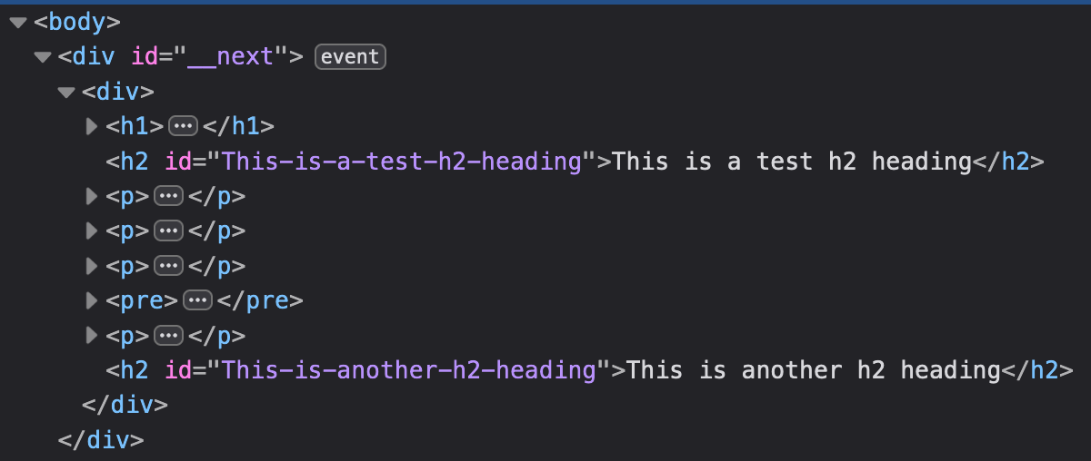
Ok, adding a magenta background is a trivial example. Maybe you would like to add an id attribute to your h2 headings to make them link-able so that you could create a table of contents - that's what I have done in this blog.
h2({ node, inline, className, children, ...props}) {
  return (
    <h2
      id={children[0].replaceAll(' ', '-')}
    >{String(children).replace(/\n$/, '')}</h2>
  )
}
Here's a screenshot from dev tools code inspector after adding the above code to a <ReactMarkdown> component that renders a markdown document with two level 2 (##) headings.
Conclusion
After analysing the components prop that is passed to <ReactMarkdown> components, I feel like I understand the process a lot better. I am also able to define whatever custom components I like and this makes the React Markdown package a whole lot more useful to me.
I hope you feel the same.